这一次,我们想分享一个非常好的动画CSS3按钮,这个按钮CSS3动画共有五种方式,每个过的动画鼠标,虽然这些CSS3教程动画按钮是不是很漂亮,但不觉得小编像其他按钮因为难以扩大,我们可以修改CSS代码,随意改变自己喜欢的风格的颜色。
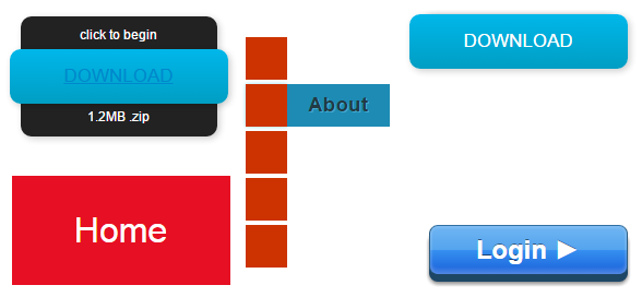
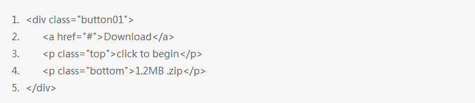
让我们一起来看看实现这5种样式动画按钮的HTML代码和CSS代码吧。以第一个按钮为例,操作起来并不是很难。CSS3教程按钮代码如下:
HTML代码:
CSS代码:
.button01 {
width: 200px;
margin: 50px auto 20px auto;
}
.button01 a {
display: block;
height: 50px;
width: 200px;
/*TYPE*/
color: white;
font: 17px/50px Helvetica, Verdana, sans-serif;
text-decoration: none;
text-align: center;
text-transform: uppercase;
/*GRADIENT*/
background: #00b7ea; /* Old browsers */
background: -moz-linear-gradient(top, #00b7ea 0%, #009ec3 100%); /* FF3.6+ */
background: -webkit-gradient(linear, left top, left bottom, color-stop(0%,#00b7ea), color-stop(100%,#009ec3)); /* Chrome,Safari4+ */
background: -webkit-linear-gradient(top, #00b7ea 0%,#009ec3 100%); /* Chrome10+,Safari5.1+ */
background: -o-linear-gradient(top, #00b7ea 0%,#009ec3 100%); /* Opera 11.10+ */
background: -ms-linear-gradient(top, #00b7ea 0%,#009ec3 100%); /* IE10+ */
background: linear-gradient(top, #00b7ea 0%,#009ec3 100%); /* W3C */
filter: progid:DXImageTransform.Microsoft.gradient( startColorstr=’#00b7ea’, endColorstr=’#009ec3′,GradientType=0 ); /* IE6-9 */
}
.button01 a, p {
-webkit-border-radius: 10px;
-moz-border-radius: 10px;
border-radius: 10px;
-webkit-box-shadow: 2px 2px 8px rgba(0,0,0,0.2);
-moz-box-shadow: 2px 2px 8px rgba(0,0,0,0.2);
box-shadow: 2px 2px 8px rgba(0,0,0,0.2);
}
p {
background: #222;
display: block;
height: 40px;
width: 180px;
margin: -50px 0 0 10px;
/*TYPE*/
text-align: center;
font: 12px/45px Helvetica, Verdana, sans-serif;
color: #fff;
/*POSITION*/
position: absolute;
z-index: -1;
/*TRANSITION*/
-webkit-transition: margin 0.5s ease;
-moz-transition: margin 0.5s ease;
-o-transition: margin 0.5s ease;
-ms-transition: margin 0.5s ease;
transition: margin 0.5s ease;
}
/*HOVER*/
.button01:hover .bottom {
margin: -10px 0 0 10px;
}
.button01:hover .top {
margin: -80px 0 0 10px;
line-height: 35px;
}
/*ACTIVE*/
.button01 a:active {
background: #00b7ea; /* Old browsers */
background: -moz-linear-gradient(top, #00b7ea 36%, #009ec3 100%); /* FF3.6+ */
background: -webkit-gradient(linear, left top, left bottom, color-stop(36%,#00b7ea), color-stop(100%,#009ec3)); /* Chrome,Safari4+ */
background: -webkit-linear-gradient(top, #00b7ea 36%,#009ec3 100%); /* Chrome10+,Safari5.1+ */
background: -o-linear-gradient(top, #00b7ea 36%,#009ec3 100%); /* Opera 11.10+ */
background: -ms-linear-gradient(top, #00b7ea 36%,#009ec3 100%); /* IE10+ */
background: linear-gradient(top, #00b7ea 36%,#009ec3 100%); /* W3C */
filter: progid:DXImageTransform.Microsoft.gradient( startColorstr=’#00b7ea’, endColorstr=’#009ec3′,GradientType=0 ); /* IE6-9 */
}
.button01:active .bottom {
margin: -20px 0 0 10px;
}
.button01:active .top {
margin: -70px 0 0 10px;
}
以上就是CSS3教程的动画CSS3按钮案例,以上的漂亮样式都学会了没?了解更多相关资讯或视频教程欢迎进入课课家查询详情。